
In this page
Excel pivot chart tutorials
How to create Excel pivot charts for Jira data?
Creating pivot charts from pivot tables
Creating pivot charts without pivot tables
Exporting the pivot chart
Working with the pivot chart
Resources
Next step
What is a pivot chart?
Pivot charts are graphical representations of the data in pivot table reports. Using pivot charts in addition to pivot tables helps you to understand trends behind your data faster. The pivot charts are also fully interactive: you can efficiently change every details without re-exporting it from Jira.
Excel pivot chart tutorials
We highly recommend reading the Pivot Tables page before this one, to make sure that you are familiar with the concepts.
In addition to the recommended readings in the pivot tables tutorial, we also recommended reading these:
- Overview of PivotTable and PivotChart reports — great introduction (by Microsoft).
- Create a PivotChart — the official tutorial in the Excel documentation (by Microsoft).
- Pivot Chart tutorial — an illustrated step-by-step guide (by Excel Easy).
How to create Excel pivot charts for Jira data?
Pivot charts can be created in two ways, which are detailed in the next sections. The main difference is whether you create a pivot table to be behind your pivot chart, or not.
Creating pivot charts from pivot tables
This is the easier, recommended way.
Instructions for Excel:
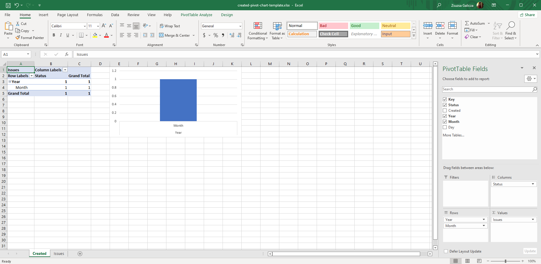
- Create an Excel template with a pivot table as described in the Pivot Tables tutorial.
- Select your pivot table in the template.
- Go to the PivotTable Tools ribbon in Excel and click PivotChart. Select a column type chart.
- In order to place the chart in its own sheet, right-click the pivot chart and click Move Chart. Select the New sheet option and name it "Current Status by Creation Date".
Now your part is done.
From this moment, your pivot table and your pivot chart will be kept in sync. If you make any change to one of them, like moving a field from rows to filters, that will be automatically reflected in the other, as well.
Creating pivot charts without pivot tables
Coming soon!
Exporting the pivot chart
You can make an export now:
- Upload your template to the app.
- Create a new view named "Status by Creation Date Chart (Excel)" for this new template. Enable it for at least the "Issue Navigator" context (or "Multiple Issues" in pre-2.2.0 versions).
- Run a JQL query that returns a list of issues.
- Export the result using your new view.
Yay, what a wonderful pivot chart!
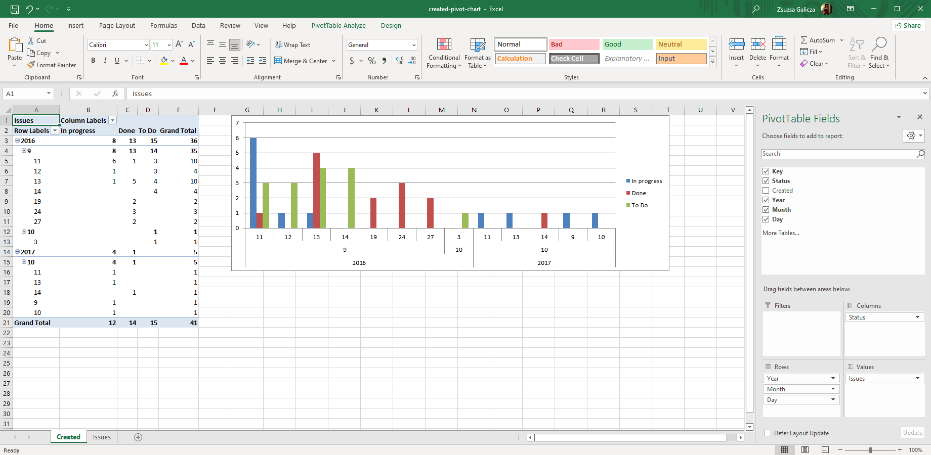
What happens in the background? During the export, the app will fill the source data cells with actual data. Then, as soon as you open the spreadsheet in Excel, it will find the named data range and display your pivot chart.
Working with the pivot chart
Pivot charts are just as powerful as pivot tables. Experiment with the tons of interactive features in Excel, for instance:
- Your initial chart may be very busy as its resolution is day. If your data covers multiple years, you may have several hundred bars, each being very thin.
Drop the "Day" field in the Pivot Table Field List bar, to reduce the chart's resolution. - Click the "Status" field in the Pivot Table Field List bar and uncheck everything, but the "Open" and "In progress" items. This will filter your data to show only the outstanding work!
- Right-click an "Open" bar in the chart, go to Format Data Series → Fill and change the fill color to red. Turn the "In progress" bar to yellow.
Your chart is now more intuitive than when using the default colors. - Try multiple chart types, for example, the ones that show the exact numbers above the bars or under the chart.
- Export further data like assignee name, project name, issue type and implement new pivot charts to make your manager happy.
Enjoy your pivot chart!
Resources
![]() created-pivot-chart-template.xlsx — a sample Excel template to generate pivot charts. Use this for your experiments.
created-pivot-chart-template.xlsx — a sample Excel template to generate pivot charts. Use this for your experiments.
Next step
Read the recipes to learn useful patterns and tricks with Better Excel Exporter.
Questions?
Ask us any time.